Project goal/ Challenge:
Usability test UK developed touch-screen kiosk application to be introduced into the French market will work for users.
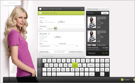
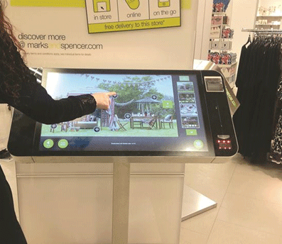
The objective of this round of testing was to assess users’ understanding and interaction with the touchscreen kiosk destined for the French market. In particular, the touch screen swiping and tapping gestures were of interest as how the participants coped with the checkout process including the credit card swipe and the barcode scanning.
Outcome:
With the key findings and report, the client team returned to review and fine-tune the application. The kiosks were eventually successfully launched in the French market.
Approach/ Constraints:
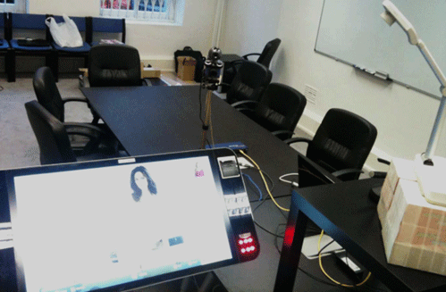
Six one-to-one usability testing sessions were carried out at RedEye’s London Victoria usability lab on 20th October 2011, with professionally recruited users. Each session lasted 1 hour.
Using a combination of task-based scenarios and think-aloud protocols, we observed user interactions, identified pain points, and captured behavioural insights. Sessions were recorded for further analysis, and findings were synthesised into key usability themes. These insights informed actionable recommendations for improving the kiosk experience.
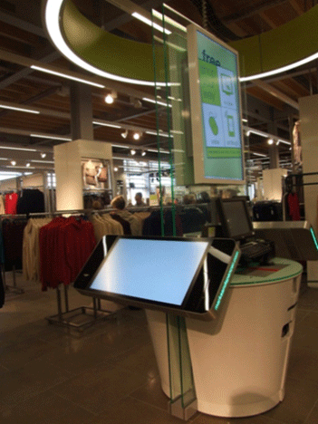
The prototype kiosk unit and software were developed in the UK. Working within the client’s budget and logistical constraints, the project team and the client agreed that usability testing could be carried out in the UK with French-speaking UK residents. It would have been ideal if the usability testing could be carried out in France where the device would be launched. Regardless, the project team set out to meet the project goal with:
- Usability testing beta software on prototype hardware
- 1 day usability testing with 6 participants
Team:
- Lead moderator
- Co-moderator – June Lim
- IT support (client & RedEye)
- UK based client coordinator
My role:
Co-moderator, Participant recruitment
Participant recruitment
Working together with the client, I prepared the recruitment profiles and screener which were signed off by the client. Using an external recruiter, we recruited a total of 6 participants and carried out a 1 day usability testing.
Usability testing script
Collaborating with the client and lead moderator, I wrote the usability testing script. Usability testing sessions were carried out in a lab setting using the prototype device supplied by the client using beta software provided by the client. Sessions were recorded and the support moderator observed from a separate room using Morae.
Reporting
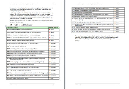
After the usability testing sessions, both moderators came together to compare findings for analysis and wrote a report for the client.
Key findings:
The kiosk was well received by many participants. The idea and inspiration behind it appealed to these participants. In its unfinished state, the core journey was achievable.
However, how to use the touchscreen was a recurring theme. Participants were initially unsure which gestures would work on the touchscreen, whether they were swiping, dragging or tapping.
Additionally, even though participants enjoyed using the kiosk and liked its look and feel, they did not know if they would use the kiosk to make a purchase. During debriefs, participants were asked if they would use it once it was installed in-store. Some replied positively, but most said they would prefer to order their clothes at home on the website.
Deliverables:
- Full report containing severity ratings table & recommendations
- Full set of video footages output from Morae recordings
Project learnings:
In retrospect, the nature of the one-off contextual study consultation, and budgetary constraint, meant the research outcomes had room to improve. From a methodology perspective, complementing this piece of research using qualitative observations with time-on-task measurements to evaluate efficiency would have given much holistic findings.